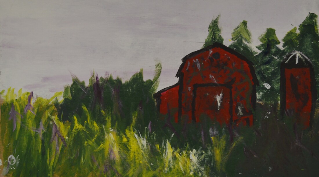
Farm LandscapeFor this project I wanted to capture some of the serenity of living in a small town. You get nice landspaces, that hasn't been touched in years. This has happened to a lot of my grandparents' neighbors. They either move away, or closer to the city, leaving this overgrown beauty that is too majestic to touch. This impacts me because I got inspiration from a building crumbling away on Highway 69 and I was trying to recreate what it could've looked like before it was falling apart, but after it hadn't been used in years. Every time I go out to my Grandpa's I always pass this building and ask myself: What was it like before? Was it a raggedy old barn, or a church out in a rural area? No one knows, I have asked my parents. This piece shouldn't only catch serenity, but that good things will crumble away slowly, some faster than others.
|
|
Chincoteague Beach, VA
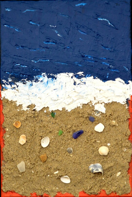
This piece was probably the hardest to complete. I faced a lot of challenges trying to get the sand to stick, or getting the correct colors that will actually look decent. For the sand it isn't just ordinary sand. This sand was taken from my childhood beach, Chincoteague Beach, VA (how I named the piece). The shells and sand glass are also from there. This piece is supposed to represent how much fun I would have on the beach, whether it was finding shells, or swimming in the sea. This place is sacred to me because it was the place where I spent most of my time with my other family. We would always put our feet in the water, and run back complaining that it was way too cold. Little did I know, the ocean at the Atlantic is always cold. It is where I spent 1/2 of my time when I was in Virginia. It was also the place where I learned how to Boogie Board. I remember the first time I caught a wave it ended having a 3-foot ripcurl and I almost fell off the board. Needless to say this piece brought back memories and tears.
For the process I started with a thin coat of paint on the bottom for where the sand was going to be. At first I tried matching the color, then I outlined it with burnt orange to represent heat. For the froth of the ocean I used modeling paste to show the layers when the waves turn to nothing and are just a white foam. For the water I used a blue-greenish color and made the waves by taking a palette knife by pressing it, lifting it, then moving backwards with the excess paint. Then I took a small paint brush and put a lighter shade of the ocean in front of it, making it look like some are curling before they even hit the shore. This piece took a lot less time than anticipated and I enjoyed doing it, even though the whole time I was worried I was going to destroy it in an astronomical way. It made me take a lot of risks, like you do every time you step out onto the water.
For the process I started with a thin coat of paint on the bottom for where the sand was going to be. At first I tried matching the color, then I outlined it with burnt orange to represent heat. For the froth of the ocean I used modeling paste to show the layers when the waves turn to nothing and are just a white foam. For the water I used a blue-greenish color and made the waves by taking a palette knife by pressing it, lifting it, then moving backwards with the excess paint. Then I took a small paint brush and put a lighter shade of the ocean in front of it, making it look like some are curling before they even hit the shore. This piece took a lot less time than anticipated and I enjoyed doing it, even though the whole time I was worried I was going to destroy it in an astronomical way. It made me take a lot of risks, like you do every time you step out onto the water.
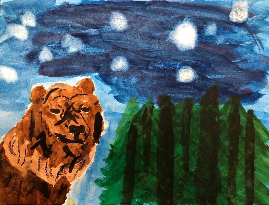
BEARRRR!!!!
|
This project turned out a lot better than I thought it would. Seeing as I haven't used watercolor in a very long time. I used a lot of cool colors in order to make the background work together. With the BEAR I had to set up a template before I put in to color. I got my inspiration by knowing that my Dad's Spirit Animal is a BEAR. The BEAR being closer is supposed to represent the matter of fact that he is watching over the trees. The trees are supposed to represent me and my siblings. As no matter what happens, he will always be there. Watching, waiting for an opportunity to help us. Even thought we are 1,100 miles apart.
|
|
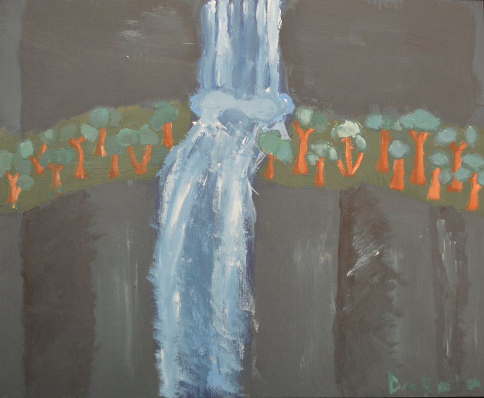
Rapid Waterfall
|
This piece was a fun one. Trying to figure out what I was going to do difficult. After many different ideas. I finally settled on a waterfall. I mainly used Pthalo and Sienna. Those are the two colors that you can see the most. I wanted the trees and the waterfall to pop the most so I made them more lighter than the rest of the painting.
I went through a few changes with the background. At first, I started with the stripes. I figured out quickly that didn't go with the overall painting. I left the background alone for a bit, then went over it with a dark and light color and realized that looked a lot better. For the trees I sketched out the trunk and branches, and then painted over them. The waterfall took me many pictures to get it the way I wanted it to look. The concept connects to me because when my life feels panicked. Yet everyone next to me feels calm. It's one of my biggest insecurities as a person. I freak out over literally everything that people don't freak out on. So sometimes I feel like a rushing waterfall. My mind falling to the floor a million miles an hour. Yet sometimes the calm of everyone else chills me out. |
|
